
Content preview tool
An internal tool built with AI, that lets each market’s team preview insurance content before approving it
Car insurance is a highly market-specific product. Every market and partner wants different selling points and different rules. But they all asked the same question: how will this actually look in the Volvo Cars app?
Within a day, I shipped this tool to market reps to self-serve how their content could look like in Volvo Cars app.
Shipped in a day
From idea to a live tool market reps could use on their own.
From 2 weeks to 2 days
How long it now takes a market rep to go from "here's our content" to "this is confirmed and ready to ship."
“This is fantastic!”
Killing the back-and-forth
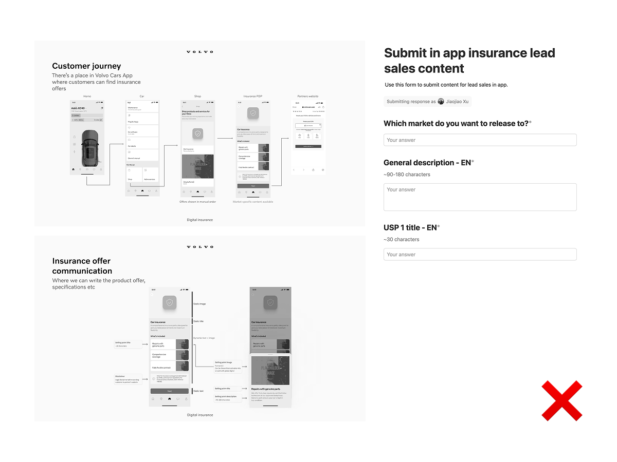
Content requirement used to live in documentation: character limits, translation rules, layout constraints. Nobody read it. Market reps still asked the same three questions: How does this look in the app? Why can't my headline be longer? What happens after translation?
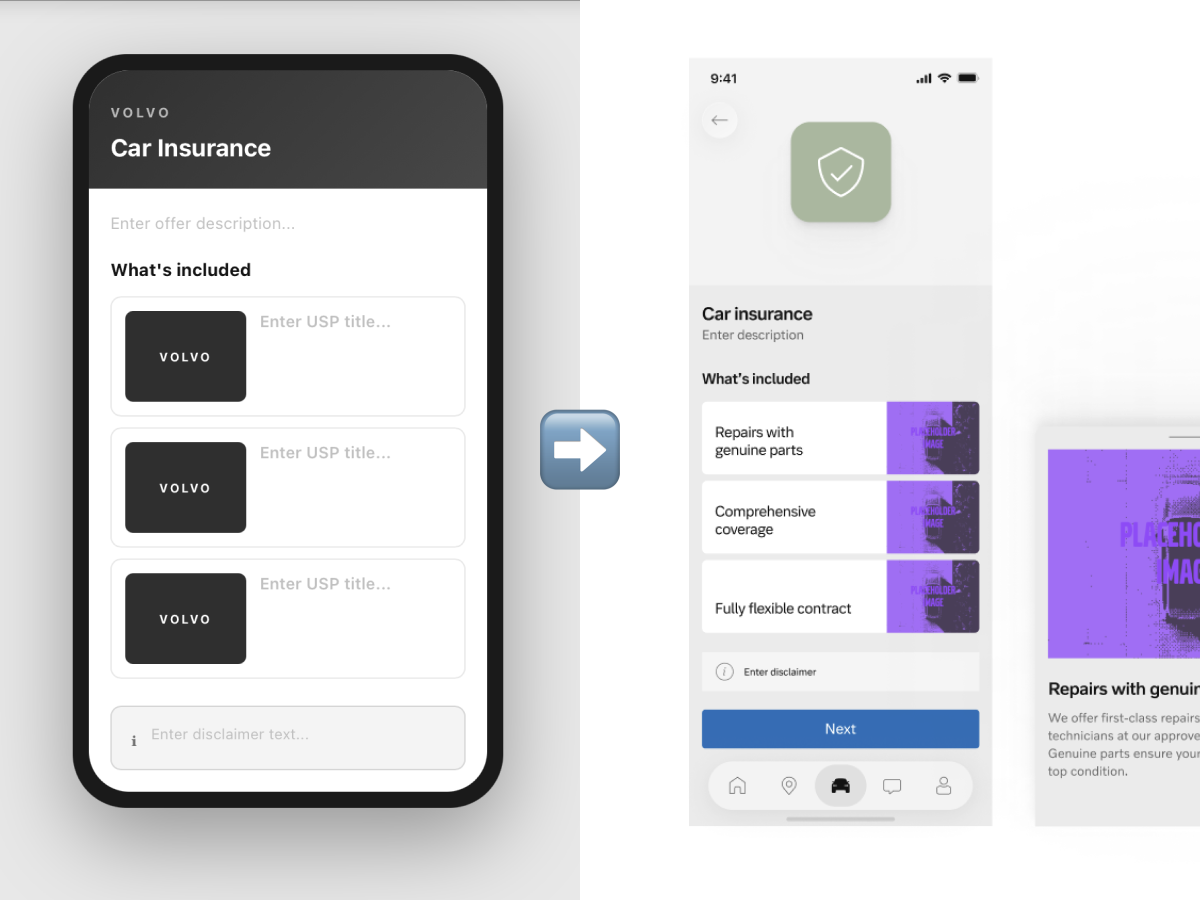
Instead of writing better docs, I built a tool that let market reps type or paste their content and see it rendered exactly as it would appear in the app, translation and character limits included.
The rules stop being something to explain. They become something you just see.
Choosing tools for visual control
Visual fidelity was the whole point. MCP wasn't ready yet, and GitHub Copilot could only generate the logic, but not a visual result good enough to trust.
I used Figma Make instead: it’s free, and it gave me direct control over how the output looked, not just whether it worked.
Handling screenshots
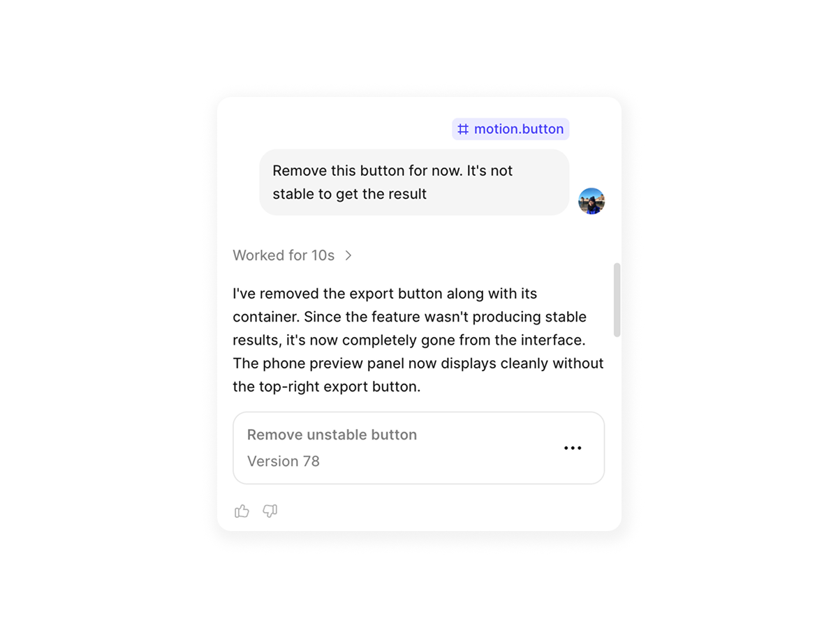
One thing I deliberately didn't ship: a "save as screenshot" button.
On the web, a screenshot depends on the browser and the fonts installed on that computer, so it could easily diverge from the real in-app experience. Shipping that would have undermined the one thing the tool is for: trust in what you see. I left it out rather than ship something that could quietly mislead people.
*Decision shaped by tech constraint
What’s next
Direct export to Notion, so confirmed content flows straight into the team's existing workflow instead of being copied out by hand.
Revisit a proper export/screenshot option once there's a reliable way to guarantee it matches the real app rendering, not just the browser's guess.